 As covered in previous section, the goal is to measure the total incremental sales generated and use that to calculate incremental ROAS. We’ll start by establishing your baseline sales and modeling the incremental sales driven by your ad spend. Then, we’ll calculate the incremental ROAS.
To do this, we’ll dip into some statistics, starting with a simple linear regression model. We’ll keep it basic for now, just looking at overall ad spend and sales. As we progress through the modules, we’ll layer in more complexity until we’ve built a full-fledged marketing mix model.
Scatter Plot:
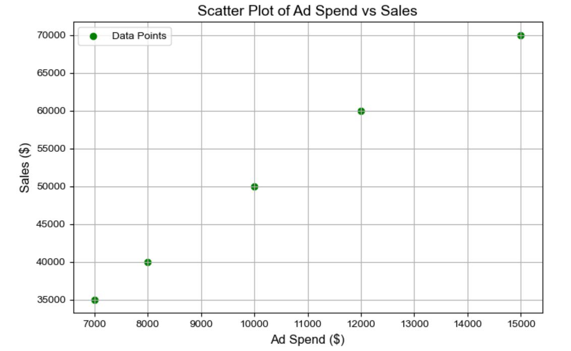
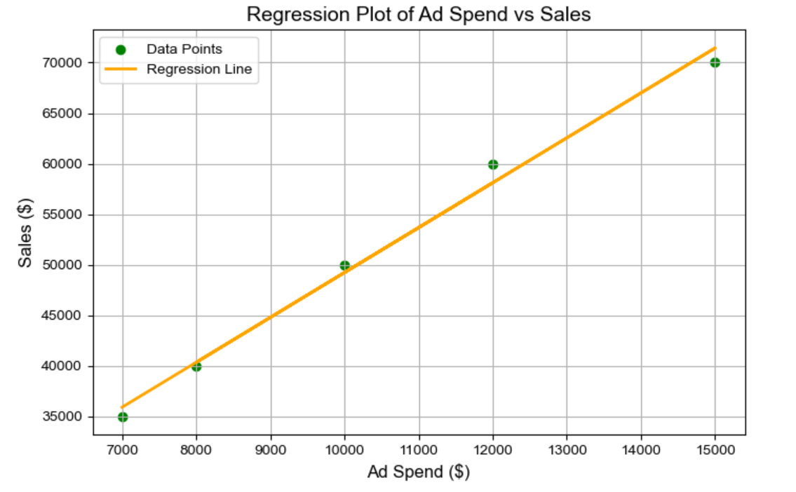
The scatter plot visualizes the relationship between ad spend and sales for the five months of data. Each blue point represents the actual data, showing a positive correlation between ad spend and sales—higher ad spend generally leads to higher sales.
Let’s dive into a simple example, like our case study where you’re selling shoes on your Shopify platform. For now, we’re focusing on total sales of all your shoes and looking at the total ad spend across all media platforms.
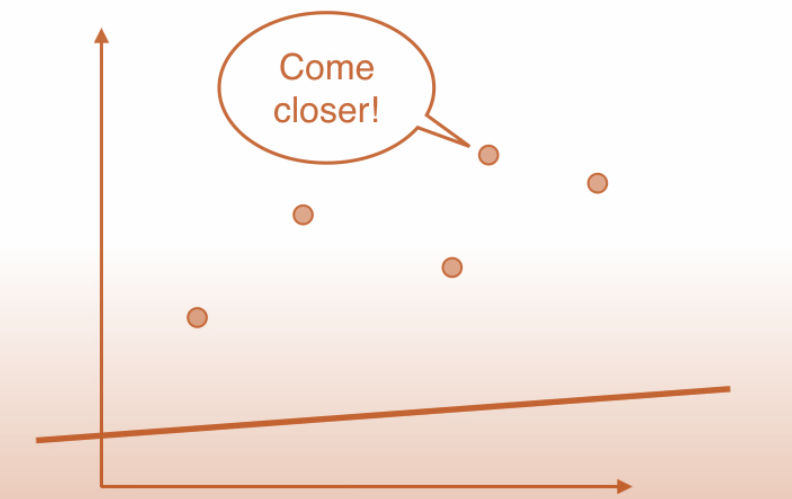
To start modeling this, you’d create a scatter plot. Now, what’s a scatter plot? It’s essentially a graph where you plot advertising spends on the X-axis and the sales you’ve generated—whether in total units sold or total revenue—on the Y-axis. Imagine you’re looking at week-by-week data over the past two years. That gives you 52 weeks per year, times two years—104 data points. Each dot on the scatter plot represents a specific week, showing the relationship between your weekly sales and ad spend.
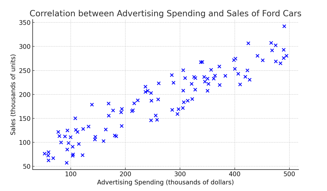
As you plot these points, you’ll begin to see a pattern emerge. Even just by eyeballing it, you can start to notice a relationship between your advertising spends and your overall sales. In this case, you’ll likely see a positive trend: as your ad spend goes up, your sales tend to go up as well.
The whole point of building a regression model is to quantify this relationship between spends and sales. In general, any regression model helps you understand how an outcome—like your sales—is influenced by one or more independent variables—in this case, your advertising spend. Essentially, you’re trying to model and make sense of how your ad investments are impacting your sales.
So, let’s get started with our basic regression and see how we can turn those insights into actionable strategies!
What is Regression
Regression analysis is a type of supervised learning technique. Why is it called supervised? Because you have a target variable—in our case, sales—that you’re trying to model using some input variables, which here are your advertising spends.
In any regression analysis, you’ve got a target to predict—our Y variable, which is sales—and features or input variables, known as X, which are your media spends, or overall advertising spends in this scenario. The goal is to use these features to model and predict the target variable.
So, how does this work practically? Imagine you have a media spend plan for next month. By plugging this plan into your regression model, you can forecast or predict what your sales are likely to be for that upcoming month. Essentially, the model helps you make data-driven predictions, taking the guesswork out of planning your future sales based on your advertising investments.
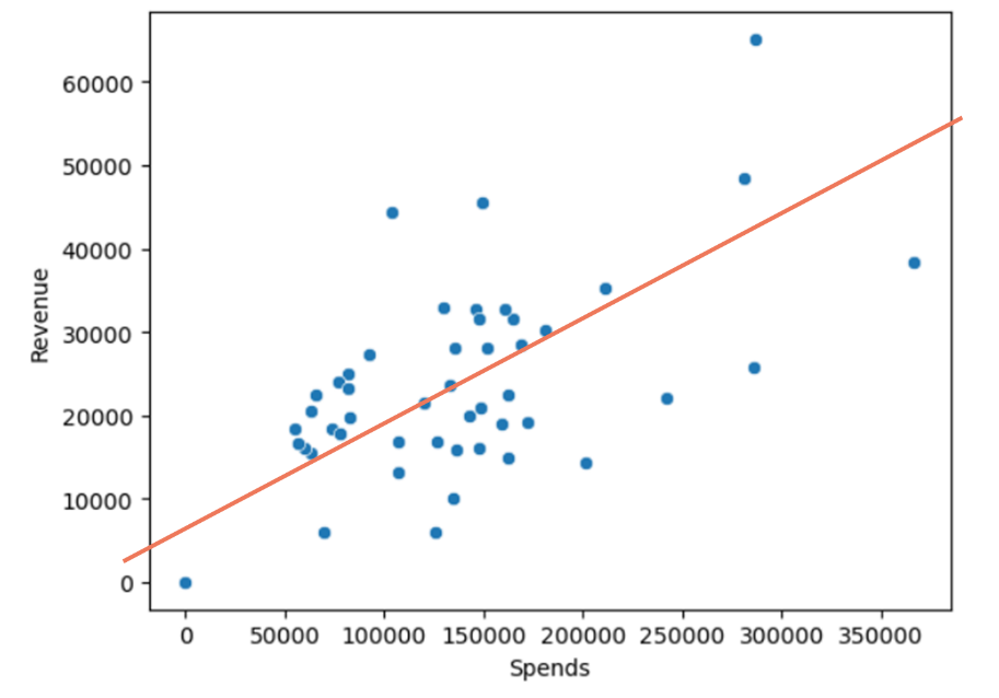
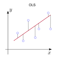
The regression plot includes a line representing the fitted regression model, clearly illustrating the linear relationship between ad spend and sales. The line demonstrates that as ad spend increases, sales also increase, which supports the idea that ad spend positively impacts sales.
Now, we can start formally putting this regression model together. Essentially, what we’re trying to find is a straight line—a line that best fits all the data points when we’re dealing with a simple linear relationship. We’ll dive into the specifics of these terms as we move forward, but for now, let’s keep it simple.
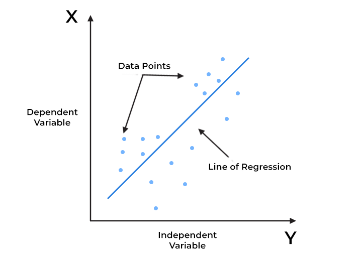
Imagine this: on your scatter plot, you have your dependent variable (the one you’re predicting)—in this case, sales—on the Y-axis. On the X-axis, you have your independent variable, which is your advertising spend. What we’re aiming to do is find that perfect line that best fits all these data points. This line helps us understand the relationship between ad spend and sales.
Now, any straight line on an XY plane can be represented by two key parameters: the intercept and the slope. The intercept is the point where the line crosses the Y-axis, and the slope is the angle or steepness of the line as it moves along the X-axis.
You might remember this from school—lines are often represented by the formula Y = MX + C. In regression terms, it’s pretty much the same: Y = B0 + B1*X. Here, Y represents the predicted value because this line isn’t just connecting the dots; it’s a predictive tool. When you have a specific value of X (spend), the line helps you find the corresponding value of Y (sales) by projecting it along the line to the Y-axis.
In this equation, B0 is the intercept—the point where the line meets the Y-axis when X is zero. So, if your ad spend is zero, the sales value you get is purely the intercept. Meanwhile, B1 represents the slope of the line. The slope tells us the relationship between X (spend) and Y (sales). Specifically, it shows how much Y (sales) changes for each unit change in X (spend). In other words, if your ad spend goes up by one unit, your sales will increase by B1 units.
So, building a simple linear regression model is all about finding the right values for B0 and B1. If we can accurately determine these values, we’ll have the regression line—a powerful tool for predictions. This line of regression isn’t just for current data; it’s what we use to make future forecasts, understand our base sales, and determine the incremental sales generated for every dollar of media spend. Essentially, it’s the backbone of our prediction efforts, helping us make smarter, data-driven decisions for our business.
Before we go any further, let’s set the record straight: no matter what model we build, it will rarely ever be 100% accurate. That’s just the nature of modeling. Remember the previous figure where we were trying to find the line that best fits all the data points? Well, that line doesn’t actually pass through every single point. It’s a simplified representation of a relationship, a best guess if you will, not a crystal ball.
So, yes—all models are wrong, but they can still be incredibly useful. The key is to work towards making your model closely mirror the actual relationship between variables, like sales and ad spend. While it won’t give you exact predictions every time, a well-tuned model can help you understand the complex dynamics at play and guide you in making more informed and powerful decisions about your marketing strategies.
The magic lies in using these models to see patterns, trends, and relationships that aren’t obvious at first glance. So, while the model isn’t perfect, it can be a game-changer in helping you navigate the tricky waters of marketing and get the best bang for your ad buck!
What can we learn from this regression model
Let’s bring this back to the problem we’re solving: a business selling shoes on a Shopify store. Our goal with this simplified linear regression is to establish what we call the “base sales.” Now, what are base sales? These are the sales that would occur even if you spent absolutely nothing on ads—no flashy marketing campaigns, just your business running as usual.
In other words, base sales are the natural, ongoing sales you’d expect without any additional marketing push. So, how do we identify this using regression analysis? It all comes down to the intercept of our regression line.
Why the intercept? In our regression equation, sales (Y) is the target we’re predicting, and ad spend (X) is the independent variable we’re using to make those predictions. But here’s the kicker: at base sales, we’re talking about zero ad spend. So, when ad spend is zero, the X term in our equation drops out, leaving us with just the intercept, B0 (B-nought).
B0 is where our line crosses the Y-axis—the point where ad spend is zero. This is the spot on the graph that tells us what our base sales are. It’s a crucial piece of the puzzle because it helps us understand the underlying sales level without any extra marketing boost. That’s what we’re trying to predict here: the foundational sales that keep your business going even without ad spend.
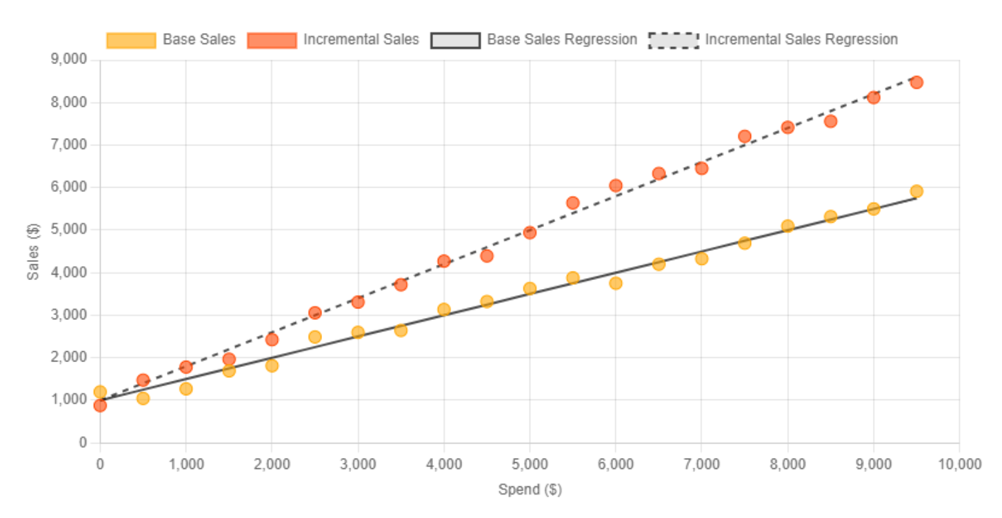
While we’ll dive deep into the process of finding this line of best fit in the first chapter—focusing on how to build a simple regression model to understand the relationship between variables like revenue and ad spend—let’s take a quick leap and assume we’ve already built our model. If that’s the case, we have our regression line, shown in orange here, along with our two key parameters: B0 (B-nought), which represents the base sales, and B1, the slope of the line, showing the change in revenue for every dollar spent on ads.
So, what do these parameters tell us? If we’ve run the model with our data, B0 is the intercept—our base sales—and B1 is the slope, representing the incremental ROAS.
Intercept (B0): 4805.83
This represents the baseline sales when ad spend is zero, suggesting that even without any ad spend, there would be around $4,806 in sales due to other factors not included in the model.
Ad Spend Coefficient (Slope or B1): 4.44
This value indicates that for every dollar spent on advertising, sales increase by approximately $4.44. This strong positive coefficient confirms the significant impact of ad spend on sales.
R-squared Value: 0.991
This indicates that 99.1% of the variation in sales can be explained by changes in ad spend, highlighting a very strong relationship.
The regression analysis demonstrates a clear, strong relationship between ad spend and sales, quantified by the positive slope of the regression line. This model supports the idea that investing in advertising significantly boosts sales, making it a critical factor for revenue growth. The visual and statistical insights emphasize the importance of carefully managing and optimizing ad budgets to maximize returns.
This way, by finding the regression line, you not only understand your base sales but also get a clear picture of your incremental ROAS, making it easy to forecast future sales based on planned ad spend. It’s like having a crystal ball for your marketing investments!
Predicting Sales with an Ad Spend of $12,000
Based on the regression model results, we can use the identified coefficients to predict sales when ad spend is set to $12,000. Here’s how the prediction is calculated:
The regression equation derived from the model is:

Using the specific values:
- Intercept (const): 4805.8252
- Ad Spend Coefficient: 4.4417
Now, with the regression line established, we can use it to make predictions. Let’s say you’re planning to spend $12,000 on ads next month. To predict your sales, you simply plug these values into your equation: your base sales ($48,105) plus your planned spend ($12,000) multiplied by your incremental ROAS (4.44). So, $48,105 + ($12,000 × 4.44) gives you the total predicted sales for the next month
Summary of the Prediction:
- Predicted Sales: Approximately $58,106.23 when ad spend is $12,000.
- This prediction reflects the combined influence of the baseline sales level (intercept) and the significant impact of increased ad spend on driving sales.
The calculated prediction demonstrates the strong positive effect of ad spend, where each additional dollar spent on advertising significantly boosts overall sales. By strategically adjusting ad spend, businesses can effectively manage and forecast sales performance, aligning their marketing investments with desired revenue targets.
And now we can also use the model to get Incremental Revenue and Incremental ROAS.
Calculating Incremental ROAS:
Incremental ROAS is calculated by dividing the incremental sales by the ad spend:
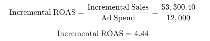
Summary of Incremental ROAS:
- Incremental ROAS: 4.44
- This means that for every dollar spent on advertising, there is an incremental return of $4.44 in sales above the base level.
The Incremental ROAS provides a clear measure of the true impact of advertising by focusing solely on the additional revenue generated by ad spend. It highlights the effectiveness of marketing investments and helps in making more informed decisions about how to allocate budgets for maximum return.
How to find the Regression Line that fits best?
How exactly do we find this line of best fit, and what does that even mean? When we talk about the line of best fit, we’re essentially looking for a line that, intuitively, passes as close as possible to all the data points. It’s like trying to draw a line that hugs your scatter plot as closely as it can—capturing the trend of the data on average.
Yet what process leads us to that best line of fit is the big question! To answer it, we’ll start with some simple data and walk through the process step by step. We’ll figure out the best way to discover and determine this line of best fit, so you can see firsthand how it all comes together.
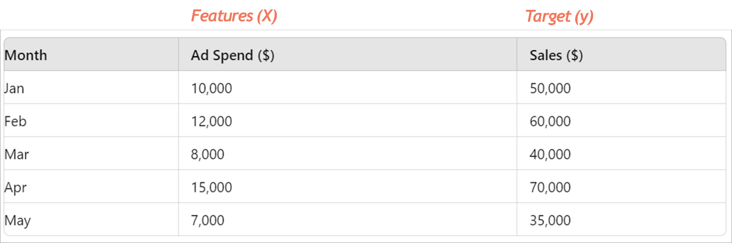
Imagine this is the data for ad spends versus revenue for our shoe company on Shopify. We’re looking at the total revenue across all the shoes sold on the platform, but to keep things simple, we’re just focusing on five months of data. On the X-axis, we’ve got our ad spends—these are our input variables or features. On the Y-axis, we have our target variable, which is sales. With these five data points, our goal is to see if we can predict sales by finding that elusive line of best fit, also known as the regression line.
We’re going to use this data to explore how this line fits through the points and understand the relationship between our ad spend and sales. Let’s find out how to draw this line in a way that makes the most sense and gives us the clearest picture of our marketing impact!
Looking at this data, you’ll notice it’s neatly arranged in an almost linear fashion. By linear, we mean you can see a clear, positive, straight-line relationship between ad spends and sales. We’re starting with this simple data to illustrate the basics of building a model. Even if I asked you to draw a line that hugs all these points as closely as possible, you could probably grab a pencil and sketch it out without much trouble.
But here’s the catch—even with data as straightforward as this, there’s more than one way to draw that line. For instance, you might draw a line that perfectly passes through the first four points. Great, right? Well, not quite, because that line would end up being quite far from the fifth point.
So, the challenge is this: how do you adjust the angle of your line to reduce the average distance from all the points? In other words, you want a line that might not be perfect for any one point but is on average the best fit for all points. You might need to tilt the line slightly—pull it a bit away from those first four points to get closer to the fifth. The goal is to end up with a line that’s, on average, as close as possible to all five points.
That’s what finding the line of best fit is all about: balancing the position so it minimizes the overall distance from all the data points, capturing the general trend without obsessing over every individual detail.
Ordinary Least Squares (OLS) method
We need to now measure the difference between the actual value of Y (sales) and the value of Y that we predict using our regression line. The metric we use to capture this difference is called the Ordinary Least Squares (OLS) method. This method helps us quantify the average distance between the predicted values from our regression line and the actual values throughout our dataset.
Here’s how it works: for any given value of X (your ad spend), the OLS method measures the vertical distance between the actual Y value (the true sales) and the predicted Y value (the sales predicted by our line). These distances are essentially the errors our model makes. By summing up these distances across all data points and calculating the average, OLS gives us a clear sense of the overall error in our predictions.
Why is this important? In any supervised learning technique, like regression, the first step is to understand the magnitude of the errors you’re making. Only by having a solid measure of this error can you take steps to reduce it and fine-tune your model to be as accurate as possible. The goal of OLS is to minimize this overall error, helping us find the line of best fit that reduces these errors to the smallest extent possible.
So, we’ll use the Ordinary Least Squares method to assess and minimize our error, guiding us toward the most optimal regression line that best captures the relationship between your ad spend and sales. This is the key to building a model that truly mirrors reality and supports better decision-making!
LEAST SQUARED ERROR
The error we mentioned earlier is also known as the Least Squared Error. Why is it called the “least squared” error? It all comes down to how it measures the differences between the actual and predicted values. The method works by squaring these differences—hence the term “squared.” Then, it sums them all up.
But why square the distances? Good question! Squaring each distance serves two important purposes: first, it ensures all the values are positive because distances, whether above or below the line, should always be positive. Second, squaring emphasizes larger errors more than smaller ones, making the model work harder to bring the line closer to all the points, not just the majority. It’s like saying, “Hey, big errors, we see you, and we’re gonna fix you!”
The Least Squared Error method then finds the line that minimizes this total of squared distances, giving us the most accurate line of best fit across the entire dataset. So, instead of just eyeballing a line, we’re using math to find the line that best represents the overall data. This calculated approach is the backbone of finding that ideal line of best fit, helping us make predictions and understand the intricate relationship between our variables.
Conclusion
So, what are we really trying to do here? Essentially, we’re trying to find a line that gets as close as possible to all the data points. Think of it like a trial-and-error exercise—or rather, an iterative process—where we experiment with different combinations of the intercept (B0) and slope (B1), creating countless lines. In fact, there are infinite possibilities!
But don’t worry, we won’t be drawing an infinite number of lines manually. There’s a systematic process for finding that perfect line, especially in simple linear regression. It’s a bit more straightforward here compared to more complex algorithms, which we’ll explore later.
The goal till now was to develop a basic intuition for how to determine the values of these parameters that define our model and line of regression. We’re starting with the simplest regression model to lay the groundwork, and from there, we’ll build up to more complex scenarios. This foundation will help us understand how to tweak those values—B0 and B1—to create a model that truly represents the relationship between our variables.
In the next section we will go through the process of finding the values of B0 and B1with a machine learning algorithm called ‘Gradient Descent Method.’
No Comments